It may very well say something about me that one of my favorite books is The Visual Display of Quantitative Information, by Edward R. Tufte, which is an (in my opinion) absolutely fascinating discussion of the right way and the wrong way to create visualizations of raw data.
The visualization of data is a bridge between the world of raw information and our minds. It's a kind of map for the mind and a good one can bring that information to life in a way that simple numbers and statistics can not.
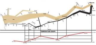
 Consider Minard's map of Napolean's march to Russia. The width of the lines indicates the size of Napolean's forces. Look at the way it shrinks and note the temperature scale on the bottom. You can practically feel the frostbitten bleeding of his troops.
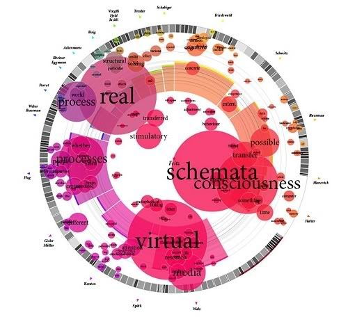
The internet has created new challenges to visualizing data but it's also given up new tools. Here is a collection of some of the most ambitious and innovative attempts to visualize data. My feeling is that some are better than others and that a number of them seem to actively get in the way but all of them are very creative and fascinating.

No comments:
Post a Comment